
Optimizing Compassion’s checkout experience
Implementing UX best practices and a new design system during checkout refactoring.
Compassion is in the process of refactoring their website, beginning with checkout. Along with some new brand elements, we’re taking this opportunity to improve the overall UX of checkout.
Role:
Design
Key objectives:
At Compassion, we pride ourselves on our highly efficient checkout process, which has consistently delivered exceptional performance. However, recognizing the importance of continuous improvement, we embarked on a redesign journey to enhance the user experience and ensure seamless transactions.
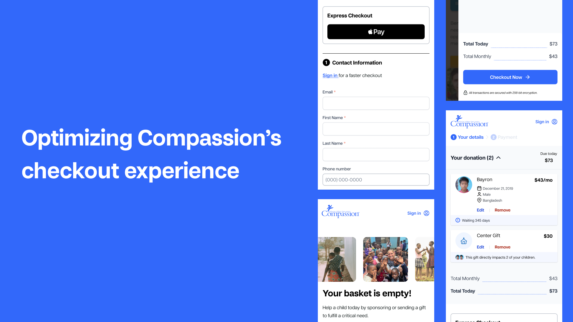
Elevating Express Checkout: Our express checkout feature has proven to be a standout performer in terms of conversion rates and user satisfaction. Despite its success, it has been somewhat overshadowed in our current design. Our goal is to elevate the prominence of express checkout options while future-proofing them to accommodate diverse vendor integrations.
Streamlining Donation Types: While our mission revolves around supporting children in need through monthly donations, the diversity of donation types offered by Compassion has led to complexity in our checkout process. To address this, we aimed to standardize the presentation of donation options, reducing cognitive load and providing clarity to users.
Optimizing Checkout Flow: Feedback from users has highlighted the perceived heaviness of our current checkout process. In response, we seek to simplify form interactions and reduce the number of steps required to complete a transaction. By adhering to UX best practices, our objective is to facilitate a frictionless checkout experience, enhancing user satisfaction and conversion rates.

Process
Business requirements, flows, and wireframes.
When I started on this project, I inherited some business requirements, user flows, and wireframes. They were dated a bit, so the work began with figuring out what was still relevant, our new dependencies, and how we wanted to test into the redesign.
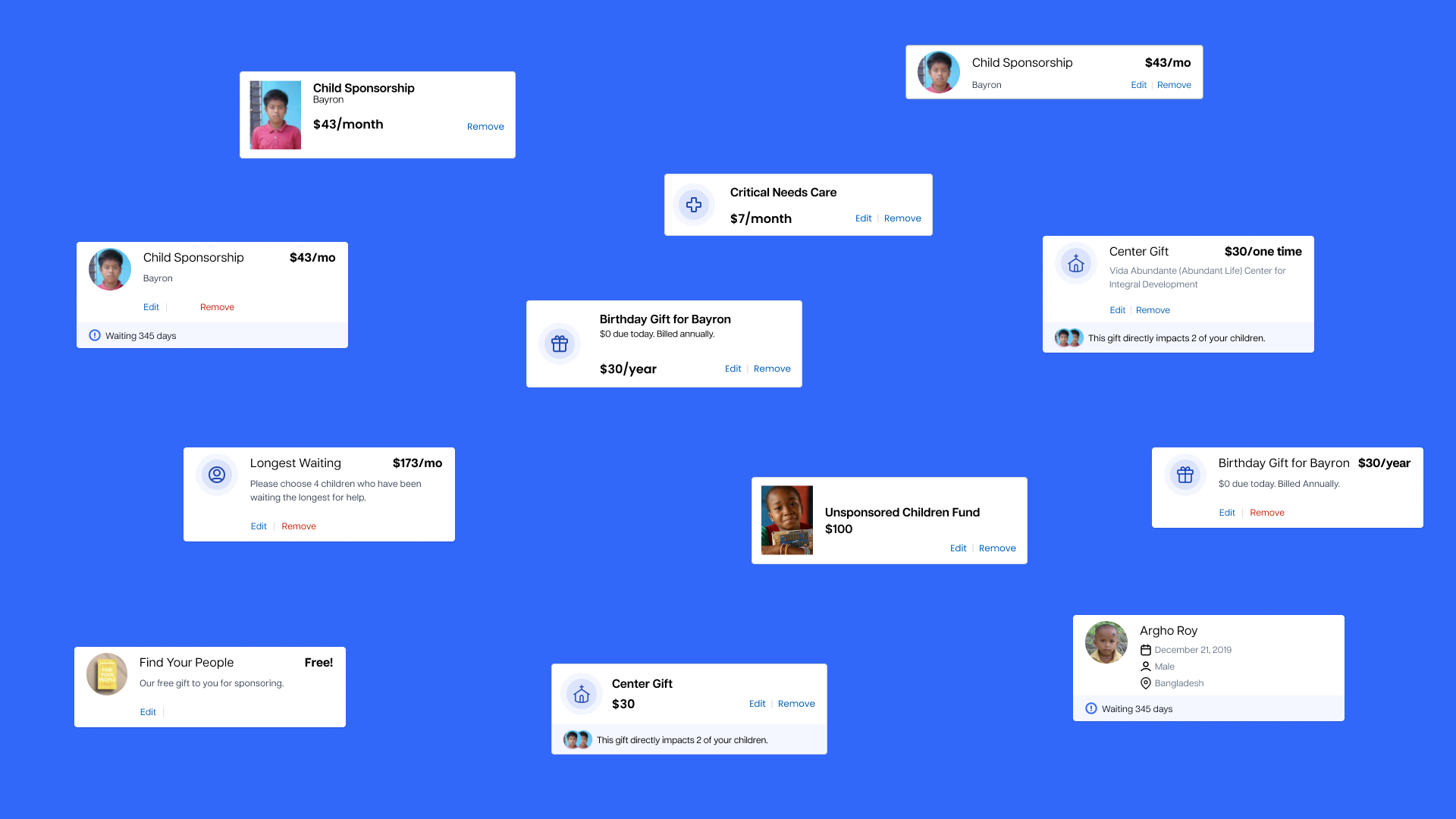
The Donation Card
Revamping the presentation of items within our cart presented a significant opportunity to alleviate cognitive load for users and streamline component utilization for developers and designers alike.
The challenge lay in crafting a versatile component capable of accommodating various donation types – from child sponsorships and funds to a range of gifts and upsells. Many of these distinctions are internal Compassion terminology, irrelevant to the end user. Therefore, our priority was to ensure clear and intuitive display of donation options, regardless of their backend organization.
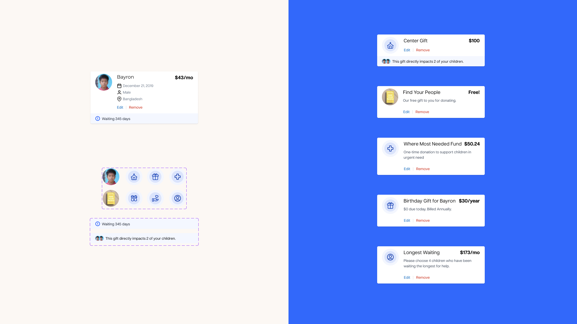
Will it flex?
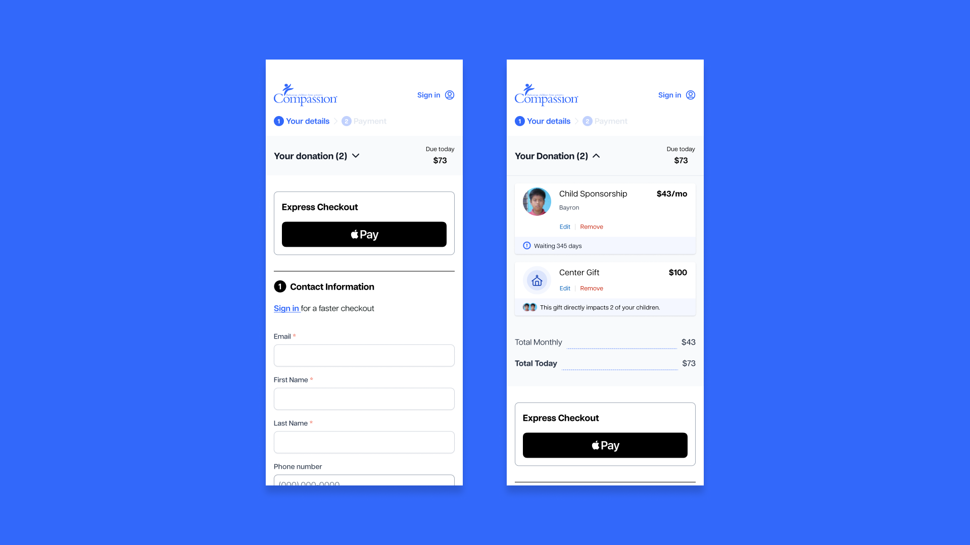
Simplifying the order summary drawer
Now that the cart item cards are standardized, how do they work within our cart summary?
The above screen is an example of the cart summary with every possible add-on. A rare circumstance, but we wanted to test the limits of how the elements work together.
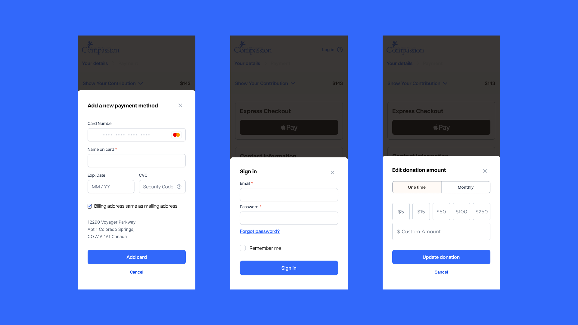
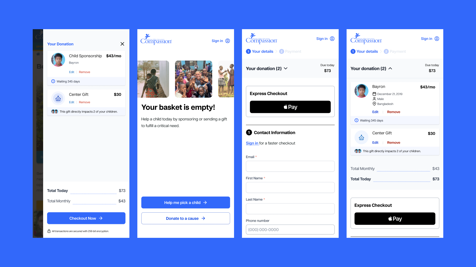
Secondary Actions Drawer
Our current checkout has a lot of secondary actions–adding new payments, signing in, editing amounts–that in their current state just add more form fields to an already long checkout form. We opted to move secondary actions to a drawer (or modal on desktop). This approach not only streamlines the checkout process but also provides users with the flexibility to seamlessly complete or exit a task should they change their mind.
Testing Results
Coming soon!