

Multi-Brand Design System for Compassion
How we built a headless, multi-brand design system for Compassion, thanks to design tokens.
I’ve spent most of my first year at Compassion working on our design system. As a multi-faceted, global organization, our work was cut out for us in creating a design system.
It feels wrong to include a design system in my portfolio. A design system is in no way a one-person job, especially at a global organization like Compassion.
That said, I want to talk about my contributions to the design system, shout out my incredible teammates, and cover some of the unique problems we’re attempting to solve with our design system.
Deliverables:
Figma component library, powered by Design Tokens.
Role:
Design Token Architecture
Design
The Power of Theming
As a global organization, our biggest need was a design system that was flexible enough to be utilized for a myriad of teams and campaigns.
Throughout the organization we have teams using wildly different tech stacks. We’re serving development teams across devices and frameworks, from iOS to .Net to React.
We also have a strong marketing arm, which runs multiple campaigns every year. How can we flex the rigidity of design systems to include the complexities of marketing campaigns?

Enter Design Tokens
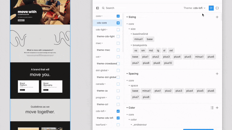
We opted to build our design system with design tokens. If you aren’t familiar with design tokens, it’s basically a nice name for saving your design decisions (colors, type, border radius, etc) as a JSON file, which then can be compiled into whatever style system you need (CSS, Android, iOS).
In order to be super flexible for theming, our tokens are broken up into three groups: core, semantic, and components.
Core tokens represent all of our potential values. It’s basically the pool from which all of our other tokens draw from.
Semantic tokens are where the theming happens. They have semantic names like background-color-primary or foreground-color-cta. When we swap out themes, we’re swapping these values.
The final layer is component tokens. These get their values from the semantic tokens and their names never change. Some examples of component tokens are button-background-color and modal-border-radius.

Learnings
The biggest learning so far is the importance of collaboration and early adoption. We’ve put a ton of effort into the relational side of the design system and it’s paid dividends. That said, there have definitely been many hiccups that could have been avoided with more awareness-building and communication. And honestly, it’s something you can’t do too much of.
Adoption
I thoroughly enjoy facilitating the integration of new teams into the CDS. The global partners of Compassion operate like franchises, functioning as independent entities. As a member of the Global UX team, I have the privilege of collaborating with each country to guide them through the onboarding process onto the system. This collaboration has provided valuable insights into adapting the system to better cater to their specific needs.

Swag
And of course, I had to make some stickers for awareness and adoption.